Why a 1970 subway rulebook still beats most brand guidelines
Opinion
·
October 29, 2026
·
by
Margaux Saulou
A client came to us recently with beautiful brand guidelines. You could tell straight away they’d chosen their designer well and invested properly in the process. Clean layouts, fonts named, colours listed with HEX codes, [plus whatever else they did include].
Then they briefed a developer to build their website from it. Then they briefed an agency to set up their social channels and run Meta ads. Three suppliers, one document, and the money they’d put into the brand was leaking out through the implementation.
The site used the right fonts and the right colours, and it looked nothing like their brand. The Meta ads got the colours and product descriptions right, but the imagery and tone were off.
The guidelines said what to use but never how. No type scale, no colour proportions, no spacing rules, nothing on how the logo behaves in a nav bar. So the developer and the agency filled the gaps with their own taste, which is exactly what anyone would do.
If your guidelines fit in a screenshot, they’re a mood board.
AI puts this problem on fast-forward. In an afternoon you can now generate a logo, a month of Instagram posts, a dozen Meta ad variations and a landing page. Each one looks fine on its own. Line them up six months later and you’ve got four different brands. Speed used to be the constraint, especially for small and medium-sized businesses. It isn’t anymore. Drift is.
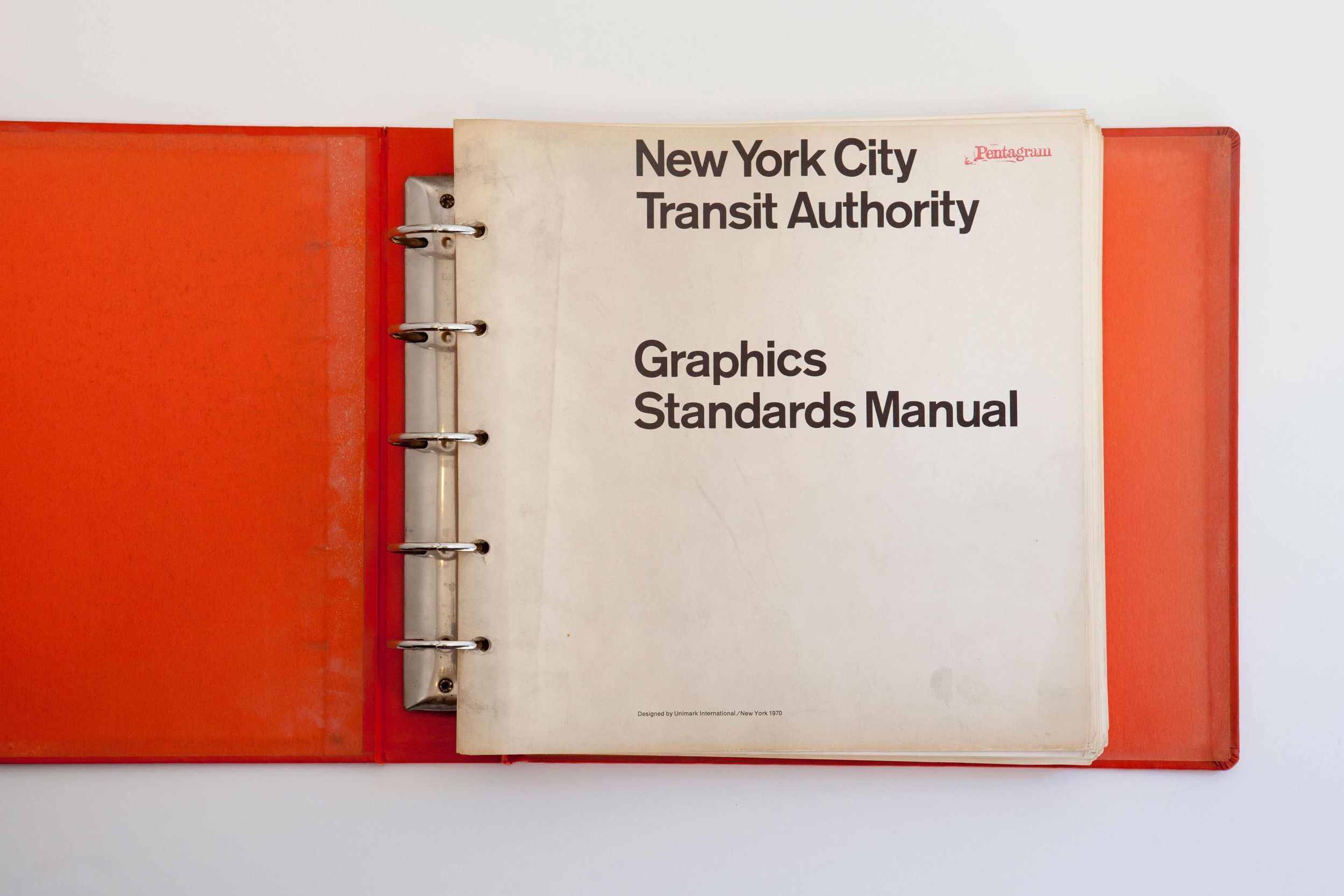
In 1970, Massimo Vignelli and Bob Noorda handed the New York City Transit Authority its Graphics Standards Manual, an oversized loose-leaf binder that specified everything from the typeface to exactly where a sign hangs. The rule behind it was simple: passengers would get information only at the point of decision. “Never before. Never after.” Michael Bierut, who worked under Vignelli for a decade before becoming a partner at Pentagram, called it “kindergarten clarity with enormous sophistication.” More than fifty years on, the signs are still on the platforms and the manual sits in MoMA’s collection. The principle hasn’t aged a day.
Paul Rand started building IBM’s graphic standards in 1956, and his eight-bar logo from 1972 hasn’t moved. When Herman Miller refreshed its identity in 2024, its first update in 25 years, the “M” Irving Harper drew by hand in 1946 made the cut. Marks don’t survive half a century on talent alone. They survive because someone wrote down the rules for using them.
At New Beach, we don’t hand over brand guidelines without both the what and the how, even when we’re not the ones implementing the work. Type scales, colour ratios, grids, logo behaviour across formats, photography, AI image direction, tone of voice and real applications. Because once we hand over, every designer, developer and AI tool that touches your brand is working from that document. It had better be complete.
Opinion
·
October 29, 2026
·
by
Margaux Saulou