Klay Landscaping
Brand refresh, photography, film and a new website for a Northern Rivers landscaping business.
Year
2026
Industry
Landscape Design & Construction
Role
Brand, Content, Marketing, Web & Digital
Challenge
A landscaping business whose work had outgrown the way its brand was being applied.
Klay’s work had earned it a strong reputation, but neither the brand nor the website had kept pace. The wordmark was sound, simple and recognisably Klay. What it lacked was a system to hold it together. Social channels, signage, vehicles and uniforms each interpreted the brand in their own way, three competing typefaces shared the load, and the palette was heavy enough to overpower the project photography. The website was where those gaps showed most.
It didn't maintain the same attention to detail as the business behind it, with a design cohesion and structure that made it hard for prospective clients to find what they came for, whether that was the services on offer, how the design and construct process worked or the projects that proved the quality. For a premium design and construct business, that inconsistency was working against the perception of quality the projects themselves had built, and the website, as the first point of contact for most new enquiries, was where it cost the most.
Solutions
Brand Strategy
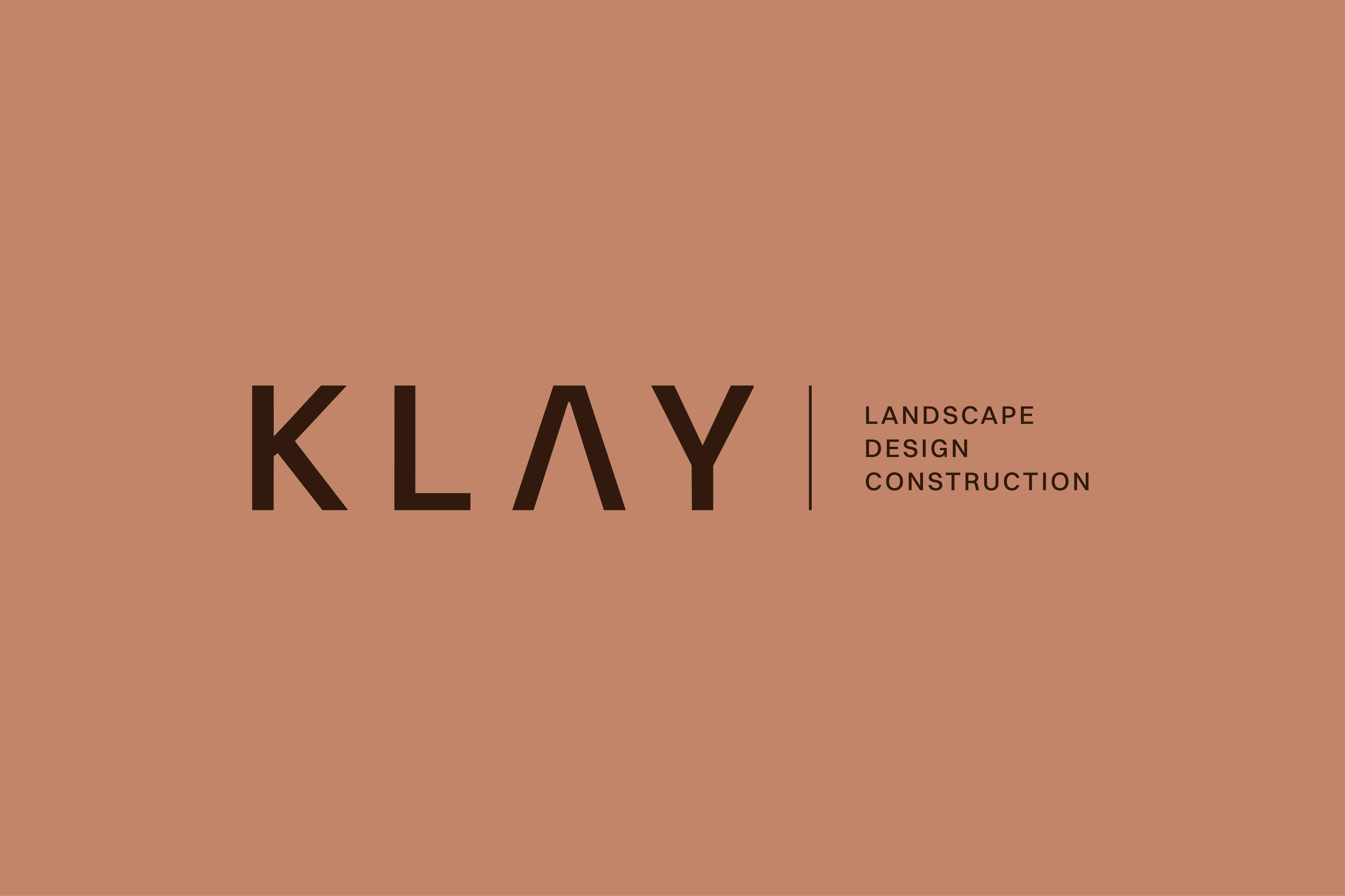
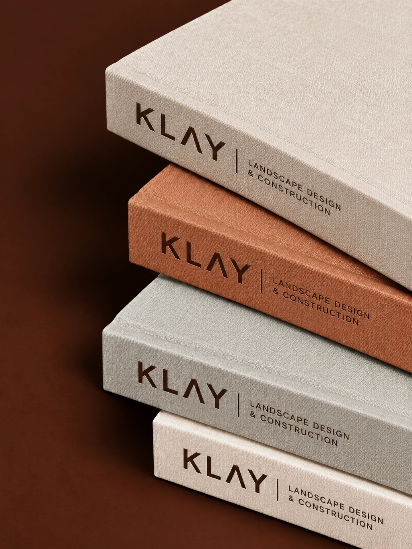
We started by deciding what to keep. The KLAY wordmark already carried the business’s equity, so we refined it instead of replacing it. We adjusted the spacing, added a clearer descriptor, Landscape Design & Construction, and built a family of lockups that holds up at any scale, from a business card to vehicle livery.
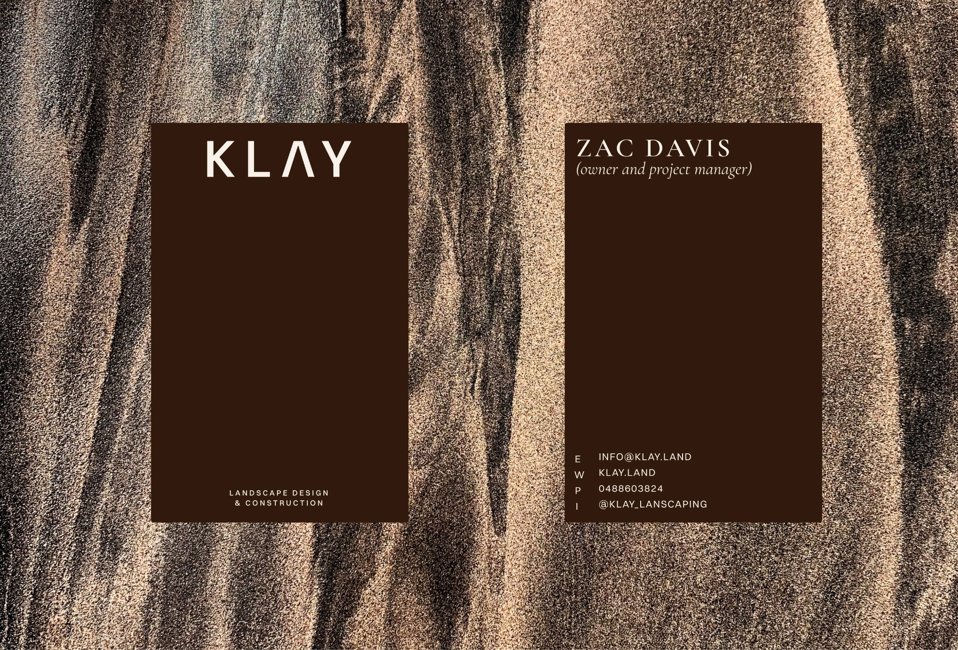
Cormorant Garamond now carries the headings, set in tracked capitals that echo the spacing of the wordmark, with Switzer handling everything else. One pairing does the job the old brand spread across three typefaces. The palette stays warm and earthy but shifts its balance. Cream, stone and white make up most of every layout, with clay and a deep bark brown held back as accents, so the projects carry the colour.
It’s all documented in a 23-page brand guideline written for the printers, signwriters and designers who will apply it, giving Klay the system it was missing.
Content & Creative
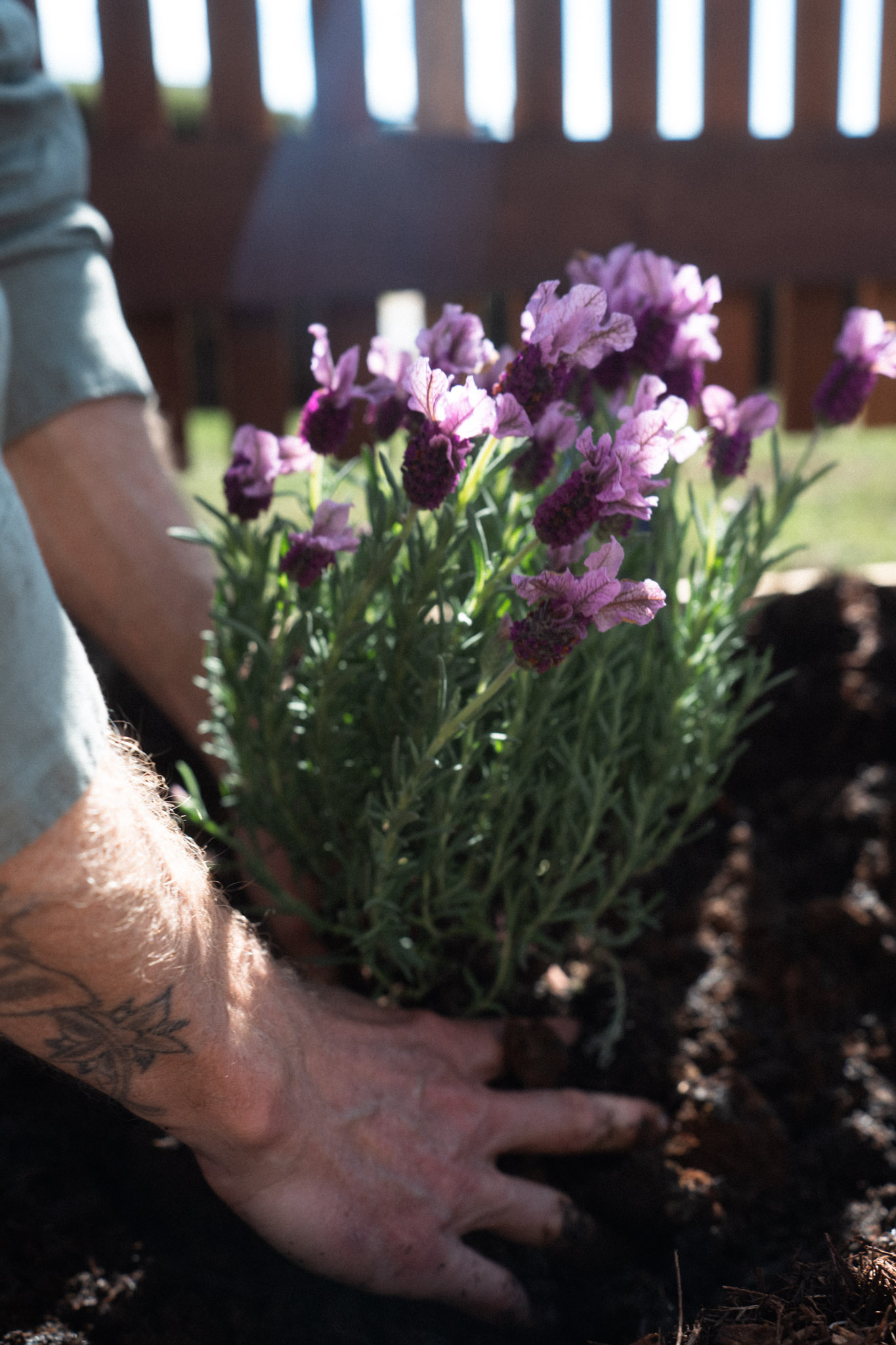
A refreshed brand needs imagery that lives up to it. Klay’s new website, social channels and print all called for photography that showed more than finished gardens: the people behind the work and how a project comes together.
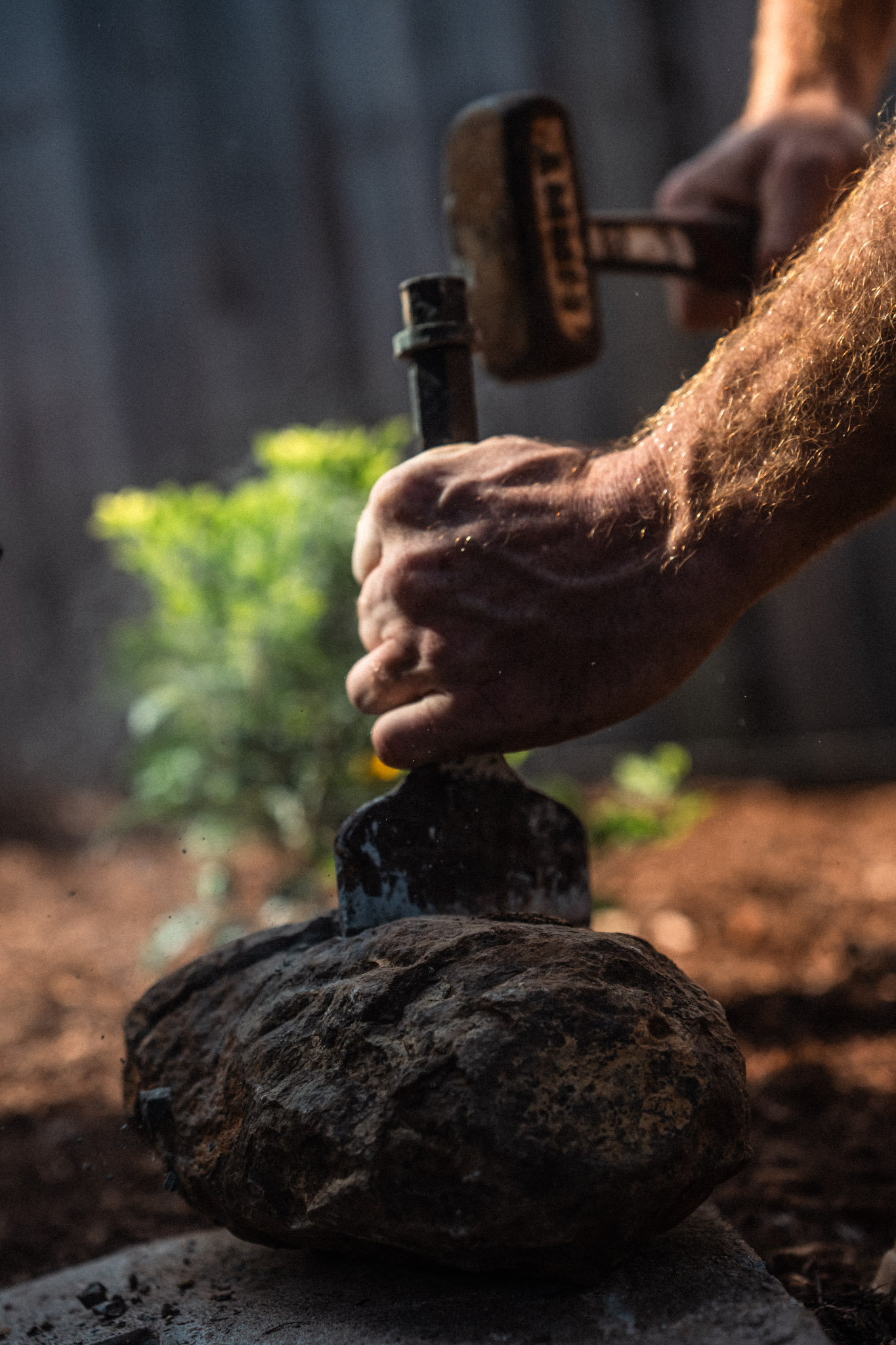
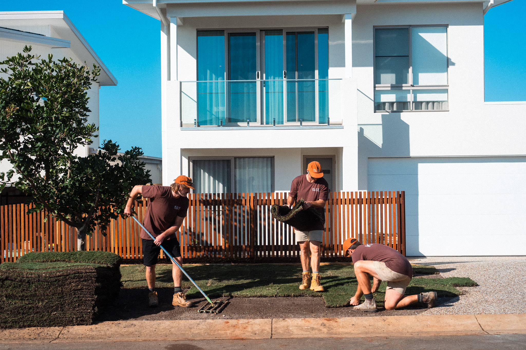
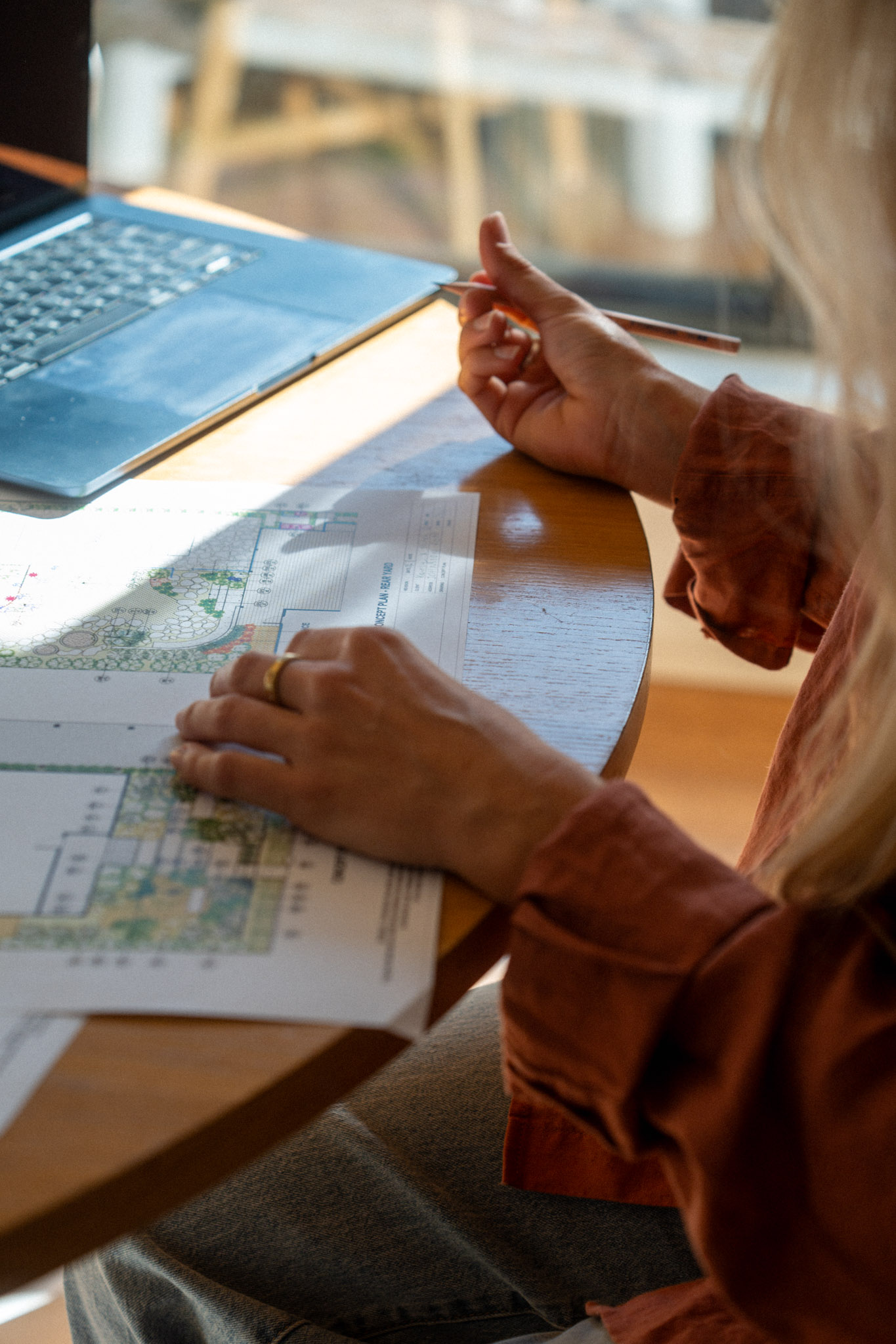
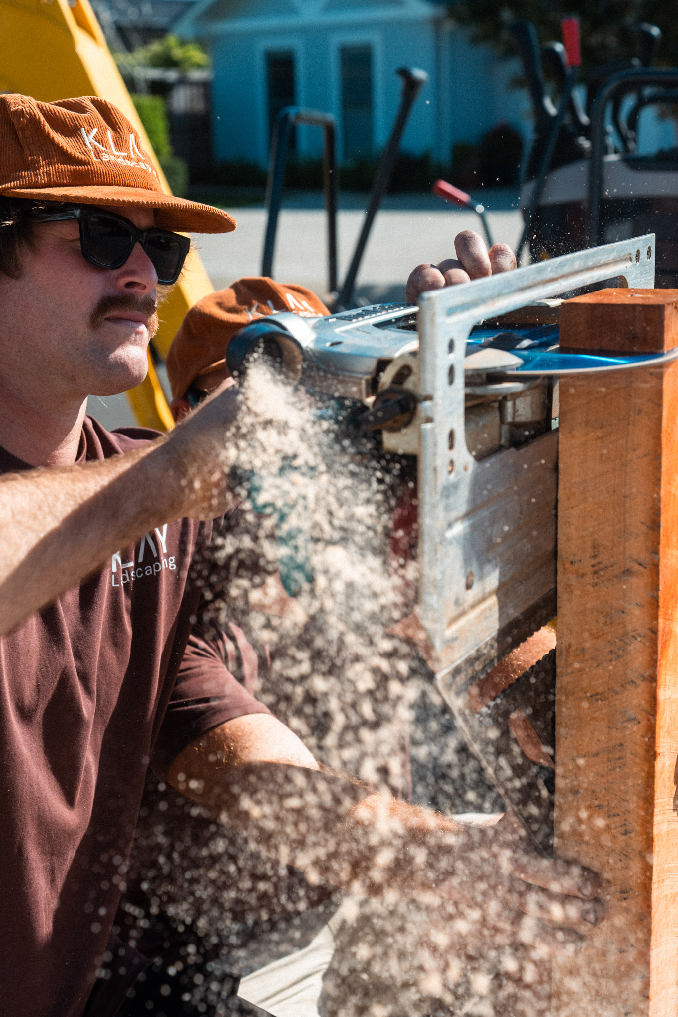
We split the shoot between the two places where that work happens. In the office, we captured the design side of the business: concept plans, stone samples and the conversations that shape a project before anything is built. On site, we followed the crew through laying turf, planting, cutting timber and splitting stone. The result is a library of real imagery that shows one team taking a project from the drawing table to the finished garden, ready to use across the website, social and future campaigns.
We also produced a one-minute brand film that moves from the shapes of the coast to the design table, tying the way Klay works back to the landscape around it.
Marketing
With the new site live, the focus moves to making sure the right people find it. We now look after Klay’s local search as an ongoing service, built around how its clients look for a landscape designer: on Google Maps, in local results across Byron Bay and the Northern Rivers, and more and more by asking ChatGPT, Gemini or Google’s AI Overviews who to call.
Each month we add a new service or suburb page, written as a direct answer to the questions people ask before a design and build project.
We also manage Klay’s Google Business Profile so it reflects the work the team is doing now, and keep the business details identical across every directory that lists it. Every month closes with a report on rankings, profile activity and how Klay appears in AI answers, all measured against the number that matters most to Zac: enquiries.
Digital
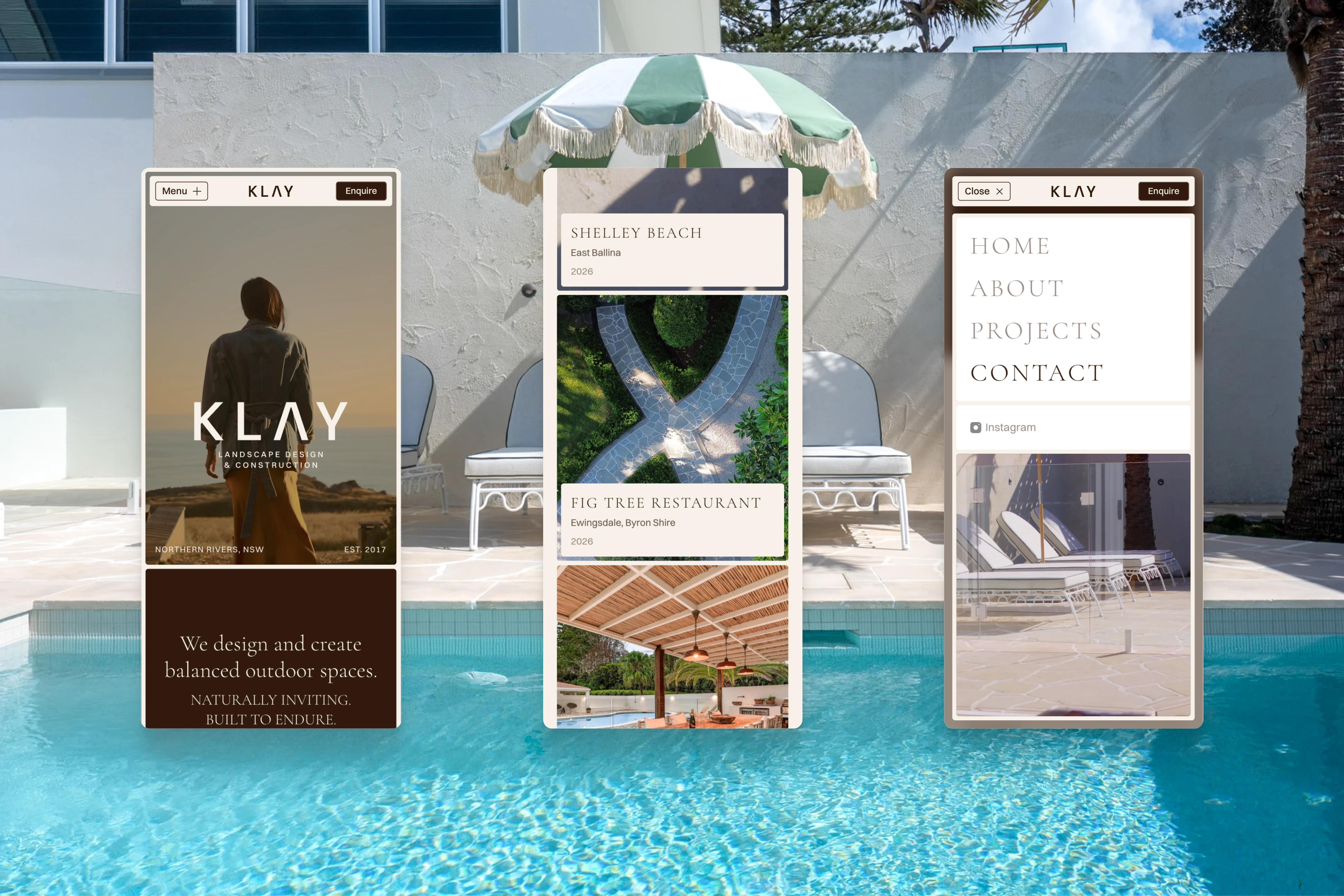
Klay’s clients rarely arrive ready to commit. They’re researching, comparing options and trying to understand what a design and build project involves, often on mobile. The website, designed and built in Framer, is structured around the questions they ask before they pick up the phone.
Every path leads to one conversation with Zac. Having the owner as the single point of contact from design through to completion is one of Klay’s clearest advantages over larger operators. The site makes that explicit instead of hiding it behind a generic enquiry form.
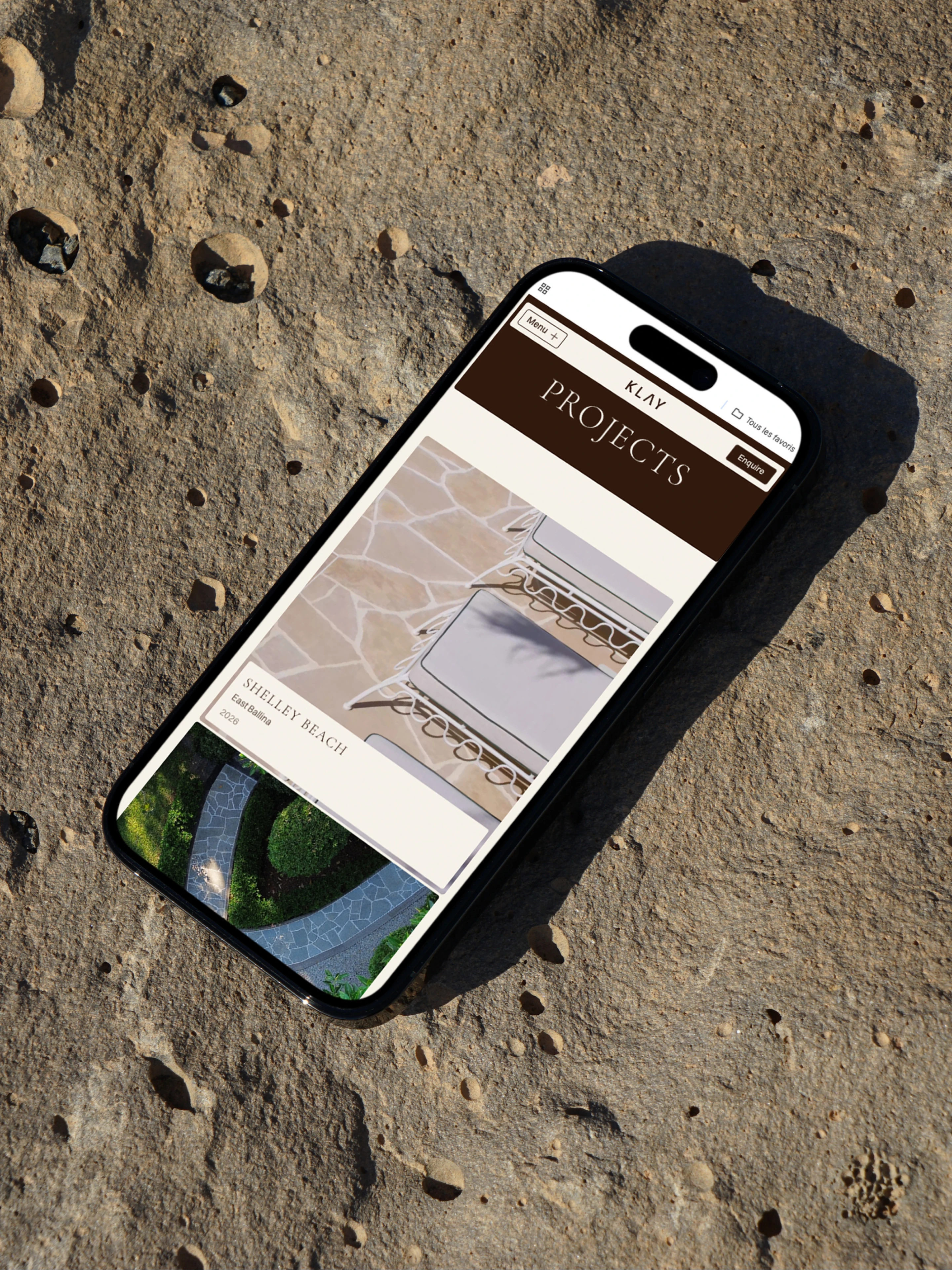
Each project page documents location, scope, year and materials. That gives prospective clients the detail they look for, and it builds the kind of specific, local content that supports search visibility across the Northern Rivers. The site is also set up so Zac can update copy and swap images himself, keeping it current as new projects are finished.