The best decision in Instagram’s refresh was the thing they left alone
Opinion
·
August 31, 2026
·
by
Margaux Saulou
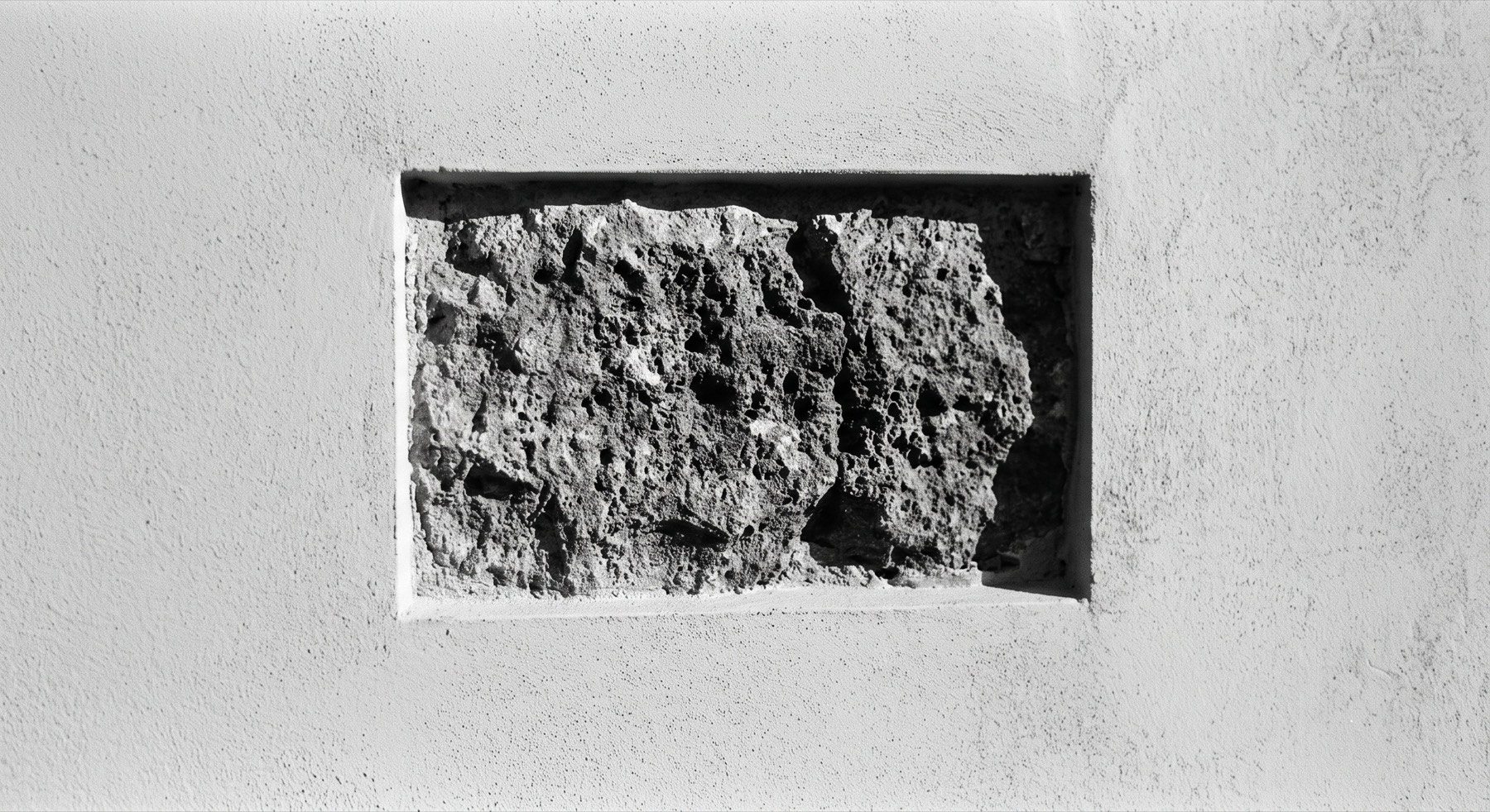
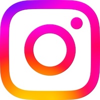
Instagram rolled out its first brand refresh in a decade on 13 August, announced in Adam Mosseri’s post that day, and it’s been mostly bagged by designers and IG users since. The wordmark’s still a script, but tighter. Loops got compressed, there’s a flourish on the s, the r and the g have morphed, and the rest of the letterforms have been squared up. Three typefaces come with it, an updated Instagram Sans plus two new ones, Instagram Pen and Instagram Mono. The gradient stays but sits lighter than before. Motion, layout and UI all get more breathing room. The camera glyph is untouched.
Almost all of the talk online has gone to the wordmark, and most of it’s negative. The new r reads like a z to enough people that Instagzam is now a joke doing the rounds. Our discussions here were about why they did it at all. Mosseri’s line about ten years having passed and it being time for a refresh is the worst possible reason to rebrand. Both complaints are valid.
But to us, the interesting thing is Instagram’s glyph. They didn’t touch it.
Name the asset that is doing the work
Recognition for Instagram happens on a home screen, at roughly forty pixels, among heaps of other icons, in well under a second. It happens by colour and silhouette, before anyone reads anything. That job belongs entirely to the glyph, and the glyph has been doing it since 2016. Change it and you spend real money reteaching several billion people a shape, with no upside available that is worth the risk.
The wordmark does a different job. It turns up on a splash screen you’ve already chosen to open, in a case study that names the platform in the headline above it, on a conference slide, in a partner deck, across merch. Every one of those contexts tells you where you are before the wordmark gets a chance to. Recognition there is kind of expected, which means the wordmark can carry risk that the glyph can’t.
They made the bigger, more noticeable changes (wordmark, fonts, layouts) in places where people already know they’re looking at Instagram, so the consequences of confusion are smaller.
The best refreshes have always worked this way. Mastercard is the clearest version of this. When Pentagram reworked the mark in 2016, they kept the two interlocking circles because their own research showed most people already recognised the brand from the shape alone. Michael Bierut called those two circles and two primary colours a gift the team was smart enough not to throw away. By 2019 the equity was strong enough that the wordmark came off entirely and the symbol stood on its own.
Holding one thing fixed is what buys you range
In a refresh, what many brands get wrong is proportional change. Nudge the mark, nudge the type, warm up the palette, tighten the grid. Everything moves ten per cent and the result is a brand that looks slightly different and no more like itself than it did before. Nothing was risked, so nothing was gained, and the deck justifying it runs to sixty pages.
The job isn’t deciding what to change. It’s finding the one thing you refuse to touch, and letting everything else answer to it.
Margaux Salou, Designer, New Beach
Deciding up front that one asset is immovable does the opposite. Look at what Instagram gave themselves permission to do once the glyph was off the table. A script wordmark, a sans, a handwriting face and a monospace face is a very wide system, wider than most brands could hold together. Range like that is only survivable when something in the middle of it doesn’t move. The fixed point is not a limitation on the work, it is the thing that makes the ambitious version of the work safe enough to ship.
The cost of getting this wrong is just as clear. Tropicana replaced its orange-with-a-straw pack in 2009, the one cue shoppers used to find it on the shelf, and lost around thirty million dollars in sales before reverting. Gap swapped its blue box for a plain wordmark in 2010 and pulled it within a week. In both cases the change landed on the exact asset that should have stayed fixed.
This is the part of the job that happens before anything gets drawn. You read the brand, find the one element already doing the recognition, and decide it does not move. On our own refresh at New Beach we kept the triangle exactly as it was and reworked the meaning behind it rather than the shape. I am doing the same for a client right now, where the icon is strong and already recognisable, so it stays and the rest of the identity gets built around it. Sometimes that gift is the icon, sometimes the type, sometimes just a colour. The work is finding it.
Sources
Mastercard: Fast Company
Tropicana and Gap: Young Marketing Consulting
Opinion
·
August 31, 2026
·
by
Margaux Saulou