Same shape, new bearing. How we gave our own logo a direction to move in.
Field Notes
·
September 8, 2026
·
by
Margaux Saulou
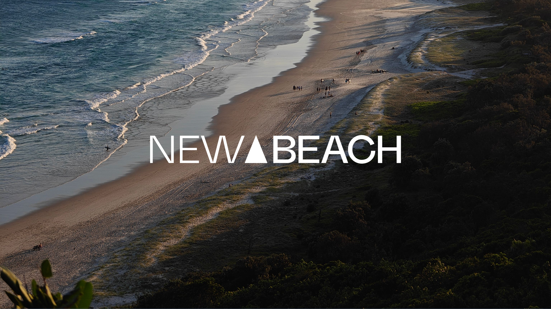
At New Beach we turn marketing into momentum. That was true long before we redesigned our logo, we just didn't look like it. It looked like an agency. It did not communicate the movement we generate for our clients.
The logo was a startup's logo, an equilateral triangle set on a slight angle, drawn in the early days and never really questioned since. As New Beach matured, the gap between how we worked and how we presented ourselves got harder to ignore. So the entire agency got together to evolve the whole system. We turned the camera lens inward and made New Beach the client.
We started where every brand decision should start, with the hardest question: what should we keep from the current identity?
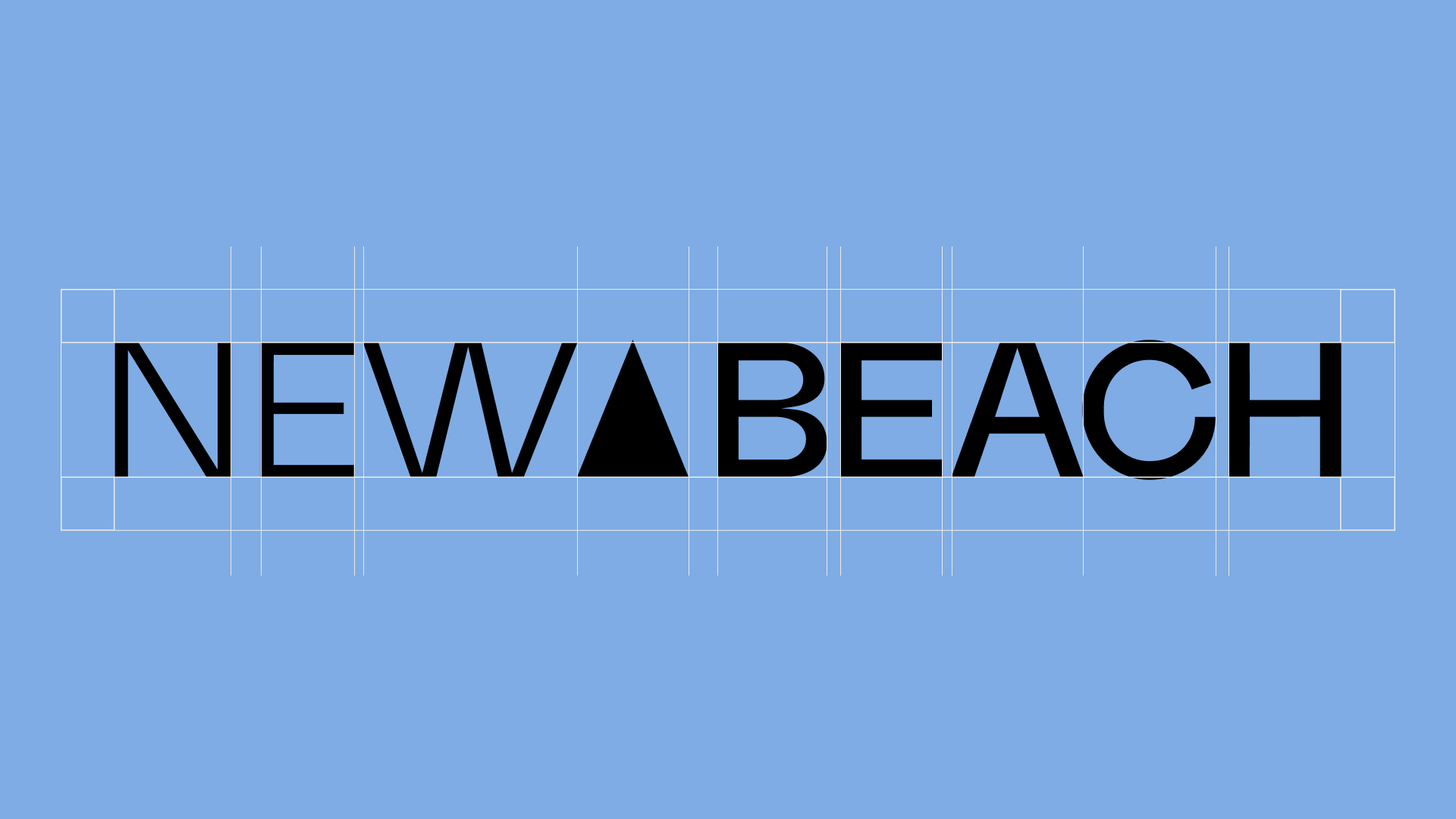
The triangle stayed and we all agreed that what it needed wasn't replacement but growth. The old one was unbalanced, bouncing and fun, fine for a young company finding its feet, wrong for an agency with a 20 year legacy and one that sells momentum for a living.
A mark drawn from the coast
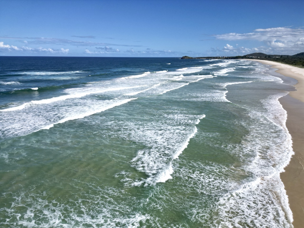
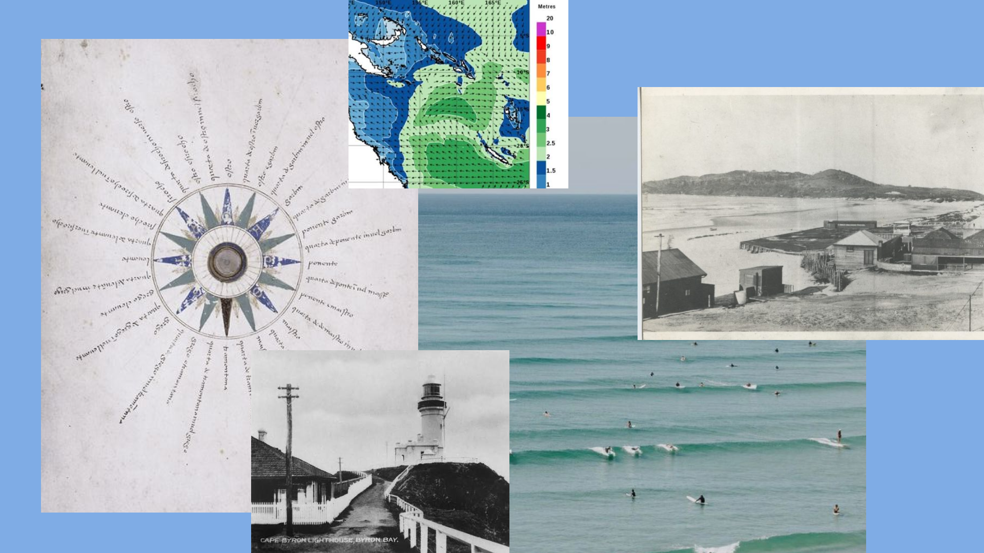
The concept that reset every decision came from outside the studio, about fifty metres outside it. New Beach works on the coast, and the coast is the brand's native material. Swell, wind, ocean, the daily physics of a place where energy is always moving toward the shore.
We work right by the ocean. The swell, the wind, the way energy keeps rolling in, that is our everyday. The mark had to come from that.
Margaux Saulou, Designer, New Beach
That reframing turned an abstract shape into a natural one. A triangle could be a wave, a sail, a compass bearing, an incoming swell. All of them share the same quality New Beach wanted to represent. Direction.
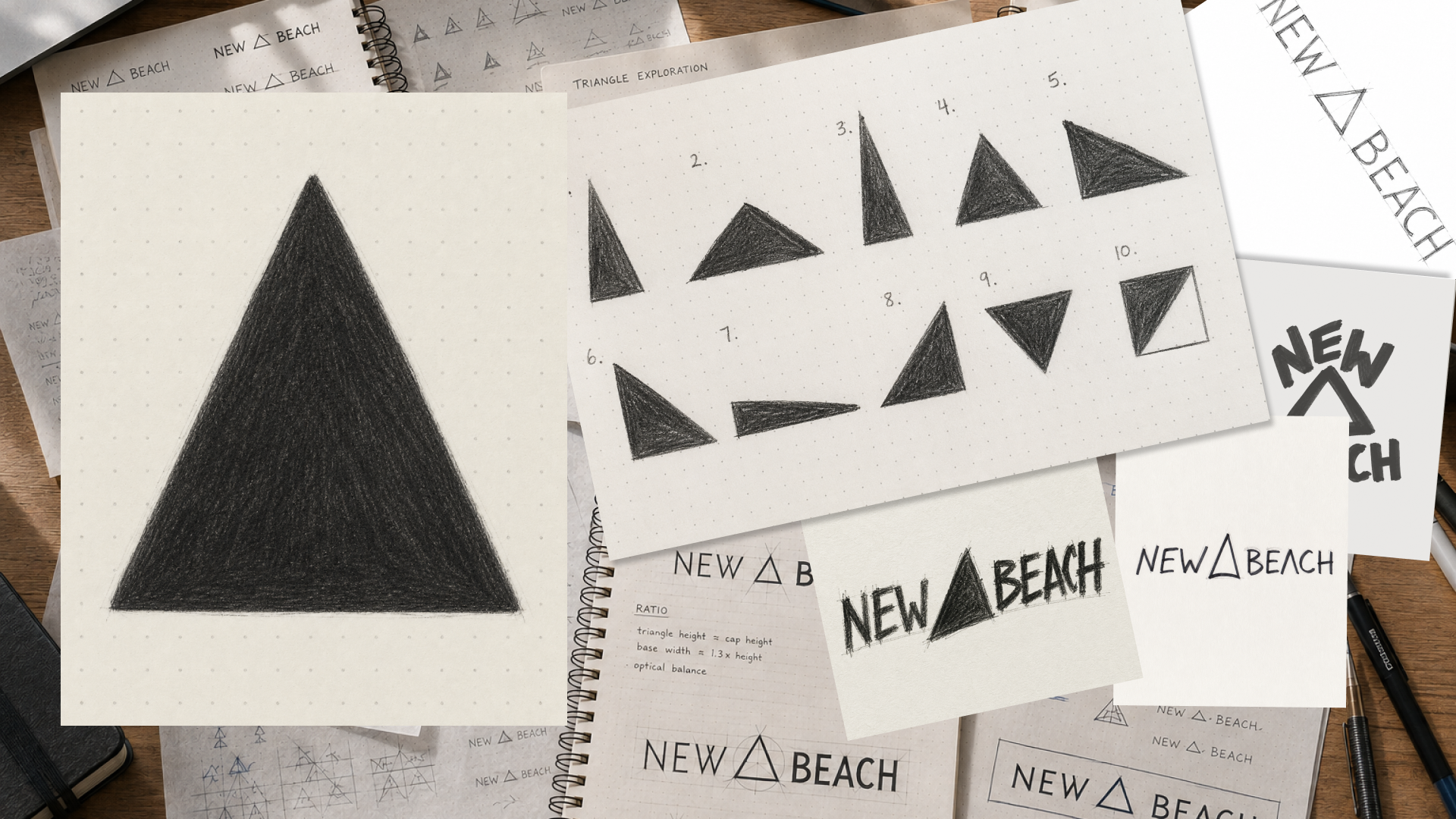
Lifting the apex
The team redrew the mark again and again, adjusting the angle by hand each time, until the geometry stopped reading as a symbol and started reading as a heading. The mark we landed on is not equilateral. It is a taller isosceles, apex at 44 degrees, base angles at 68, and a height that runs 1.23 times its base. That extra height carries the entire idea. It is the upward thrust, the bearing, the compass needle that always knows which way is forward.
An equilateral triangle just sits there. We kept lifting the apex until it stopped being a shape and started being a direction. The moment it looked like it was going somewhere, we knew we had it.
Margaux Saulou, Designer, New Beach
One mark becomes a swell
A single triangle holds a bearing. Repeat it and movement begins. The marks line up into currents, and the currents become a field New Beach calls the swell. It is the same idea scaled, one direction turning into a whole sense of motion, a literal picture of what momentum actually is, and a direct nod to Byron Bay, the place the studio calls home.
The swell is generative rather than decorative. The rotation and scale of every triangle follow a wave function of its position, so the pattern is designed and reproducible rather than random noise. Online it comes alive. The field drifts on its own and never sits still, and as a visitor moves closer the nearest triangles lean toward the cursor and warm to New Beach blue, concentrating energy without ever changing the underlying course. The visitor adds energy. The bearing stays New Beach's.
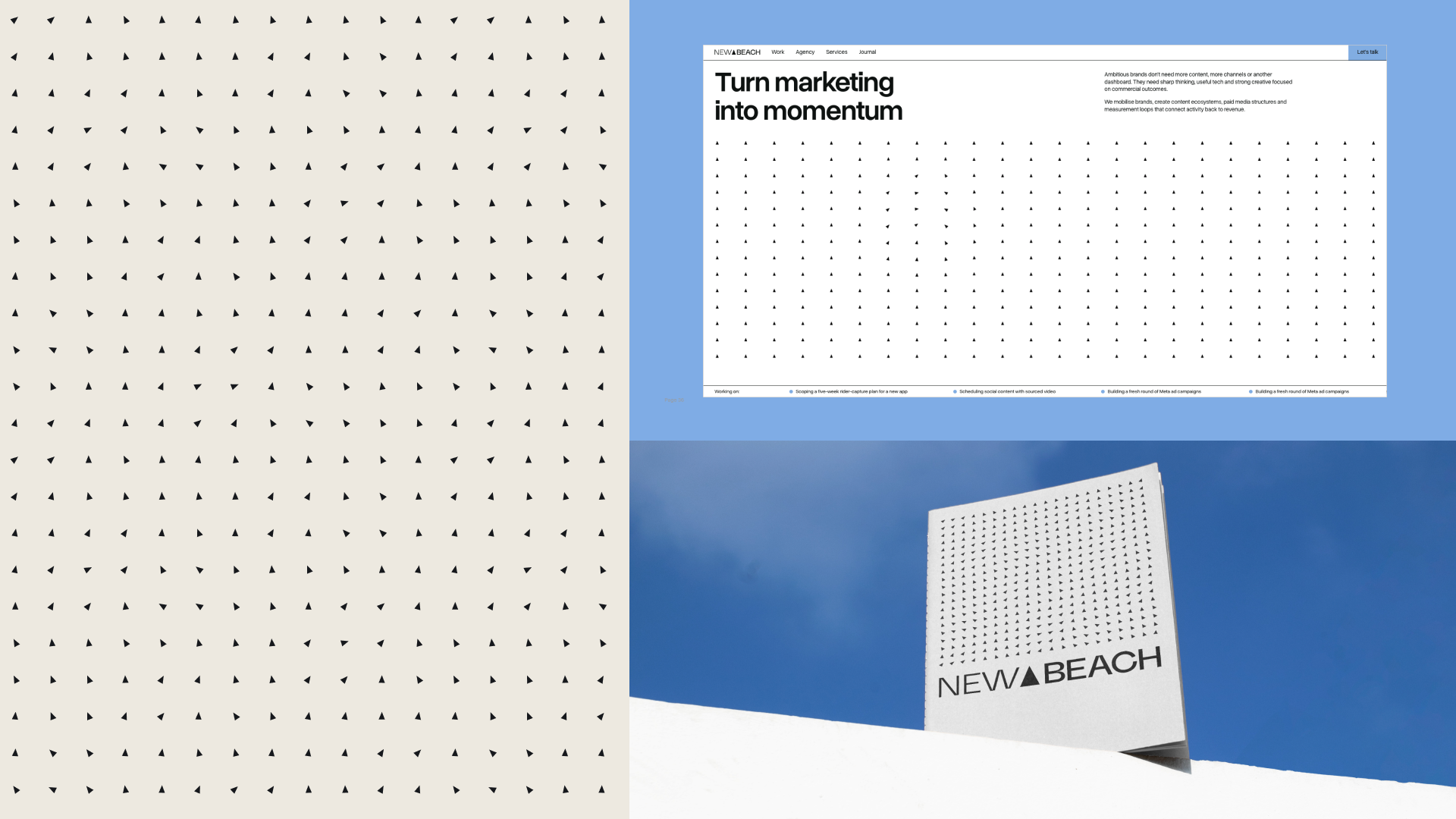
The triangle is how we make momentum visible. One shape doing the work of a whole system. Few ingredients, pushed far. That is the whole test of a brand.
Margaux Saulou, Designer, New Beach

The name, light into weight
The wordmark carries the same story in the typography. NEW is set lighter and BEACH heavier. Like a tide, the name moves between two weights, light lifting into heavy, so even a line of static capitals keeps a rhythm. The triangle between them gives that rhythm a direction.
Restraint, and one rationed accent
The palette is small on purpose. White is the ground the system sits on and the colour used most. Dark and warm paper carry the brand. New Beach blue, hex 7FACE5, is the accent, rationed hard enough that it registers when it appears. Three neutral greys handle the functional work of text, lines and fills, and nothing else competes for attention.
The confidence is in what we left out. Big type, one accent, a lot of air. The work should carry the colour, the layout should not.
Margaux Saulou, Designer, New Beach
Into the world
A brand system only earns its keep when it survives contact with the real world, so New Beach pushed the identity straight into use: across pitch decks, social tiles, our LinkedIn profile and email signatures. Same grid, same restraint, same mark holding the same bearing on every surface.
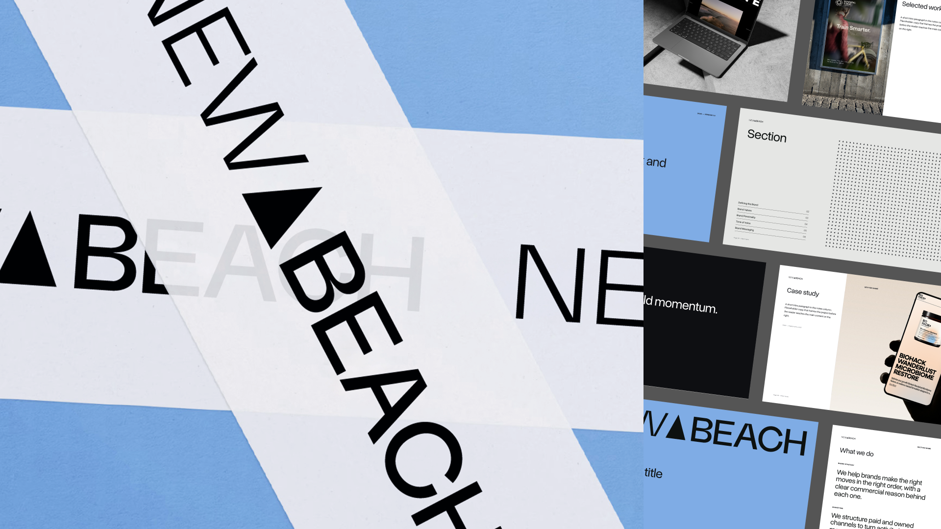
This evolution of our brand identity keeps the shape the studio started with, grows it up, and points it forward. It holds a direction, it builds a current, and it keeps moving.
Credits
Agency, New Beach.
Design and art direction, Margaux Saulou.
Typeface, Overused Grotesk.
Location, Byron Bay, Australia.
Year, 2026.
Field Notes
·
September 8, 2026
·
by
Margaux Saulou